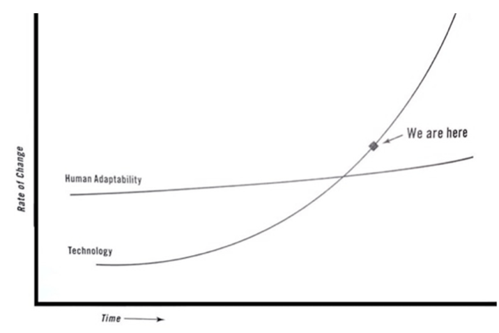
I recently watched a talk from a professional conference, and found the experience to be rather frustrating. The speaker kept alluding to graphs, which of course is to be expected at a professional conference. The problem was, the graphs conveyed subjective feelings, but the author kept alluding to them as objective facts. Here’s a graph that was taken from his speech:
Now if this were to convey someone’s feelings, that’s fine, which was likely the original intent. It just requires a lot of contextualizing, and continually alluding to the fact that this graph does not have a data set associated with it. The graph is simply an authors’ way of representing their emotions. Unfortunately, that is not what happened in the talk. The author acted as if this was an actual representation of the world, which leads me to have all kinds of questions. How do you define technology (patents, inventions, fields of study, etc.)? How do you define human adaptability? Has human adaptability mostly remained the same while technology has gone up exponentially? Couldn’t you argue human adaptability is relatively constant? And when was the intersection/inflection point between human adaptability and technology? The in-vogue answer is AI, but could it not be the invention of the nuclear bomb? What about the advent of industrialization when humans were no longer growing up in an established way of life? Or what about the invention of the bow and arrow? Could it be an oscillating graph in which human adaptability and technology go back and forth?
The point is, you cannot allude to that graph as if it were factual, and have no objective way of saying it is factual. The creator of that graph likely meant it to be more artistic, an easier way to convey a complex point (A picture graph is worth a 1000 words.) The speaker, on the other hand, alluded to it as if the graph showed his point that AI has taken off beyond human comprehension. Which certainly might be true, but the whole point of this essay is to work through the purpose of graphs and why I found this to be so frustrating. You can make that point based off data, but not in the way its presented. It’s dishonest to act like that graph has something objective to say about the world, as say a graph about the decreasing number of murders in the United States.
It’s my opinion that graphs can have one of two purposes:
The problem lies in people using purpose 2, and acting as if it were purpose 1. The whole reason we look at graphs and trust them is that they’re built off of some kind of data. Now we can argue how that data was collected, or represented, but in general graphs presenting objective data need to have a data set attached to them. We can discuss how the data was collected or represented, because its drawing from something we can debate. This is what gives graphs their legitimacy. We look at them and trust that they are built from some kind of study that investigated the world. The problem I have with the attached graph is that it is not objective data, and therefore is totally arbitrary. We can have a philosophical debate about the graph, but we cannot discuss the data involved for the simple fact that there is none. It’s further problematic when people present these graphs as objective data, because people will interpret them as objective data. It’s dishonest and unfortunately leads to confusion. Let’s use another graph to further drive conversation:
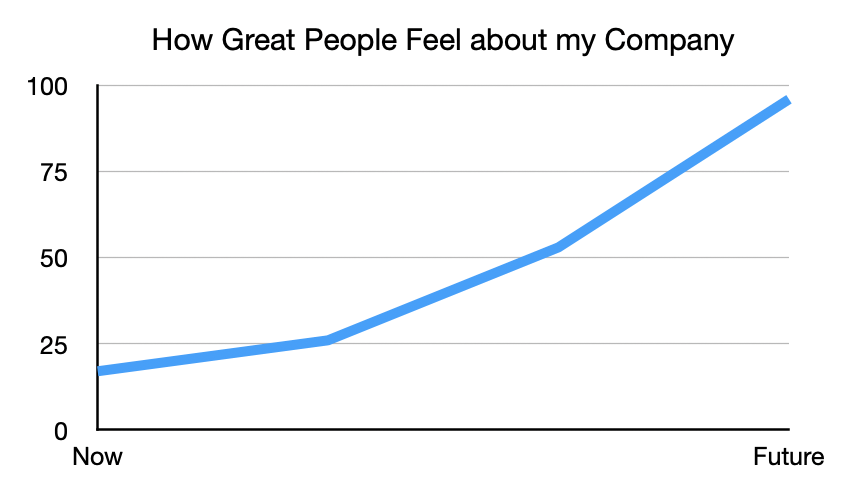
This is a slightly more concrete example that does not play into our collective societal conscious (we all feel like society is moving faster than we can keep up, that’s why that graph feels so real, and like objective data), it’s clearly self-serving. I made up the data set associated with the graph to give it the upward trend. However, this graph could easily be legitimate if It were clearly based off survey data, or other collected data that in turn could be discussed. But it wasn’t, it was clearly fabricated to convey the point I wanted it to. It is a huge disservice to data science + graphs to fabricate information. The whole reason people look at the first graph and trust it (aside from it playing off current climate surrounding tech and society) is that graphs, historically, are perceived as legitimate endeavors to collect information about the world and present it honestly.
The problem I had with the speaker was that graphs are meant to be representations of data, and any attempts to use graphs to demonstrate emotions as facts is taking a tool of statistics and perverting it for propaganda purposes. Graphs were made to tell stories from concrete sources, there is a reason that the Lascaux cave paintings do not feature line graphs. If you would like to convey an emotional point (e.g. fear about AI, technology as exponential, etc.), attempt to find data or, better yet, collect data on the subject. Do not simply make up a random graph, and present it as objective data to tap into people’s blind deference to the authority of graphs. Though we could sit back and argue that , “People should know better” this point is moot to me. People are consumers, they typically blindly ingest whatever is front of them (a crime I too am guilty of.) If we are going to create content, we have an obligation to the public that it be good and defensible. If you’re going to make a graph, it should be well sourced and not be Claude Monet masquerading as Florence Nightingale.